by Nicholas Beaudrot Via Matt Yglesias, the Center for American Progress has a map showing where the stimulus money would end up. "Wow," I said to my self, "that's neat. But wouldn't per-capita figures be more interesting?" They would, and thankfully the internet makes producing those figures quite easy:
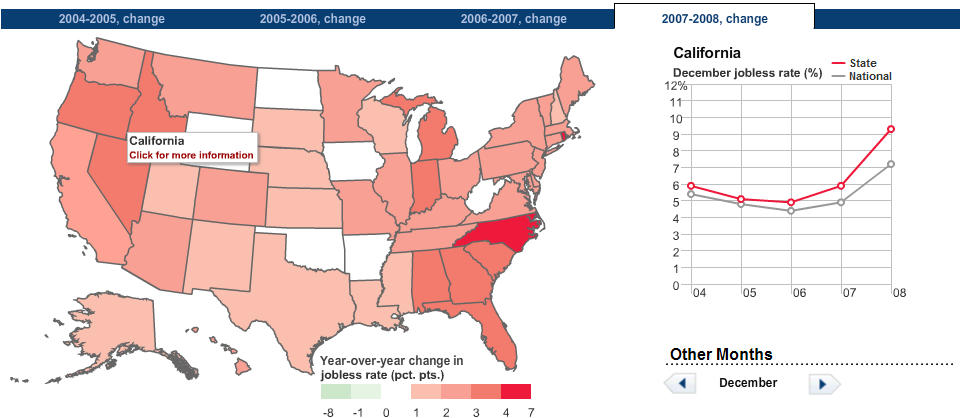
Compare that map to this one from the WSJ (via Barry Ritholtz) showing the change in unemployment over the past year:
Many thanks to CAP for publishing their underlying data.


 Many thanks to CAP for publishing their underlying data.


